A Better Read On Employment Data


Employment data published by the BLS is worthless in my view as it is self-serving. I prefer ADP’s National Employment Report (NER), which is not perfect, but represents better quality data than that published by the BLS. In terms of ADP’s NER, I prefer to analyze unadjusted numbers before they are manipulated by “seasonal adjustments”.
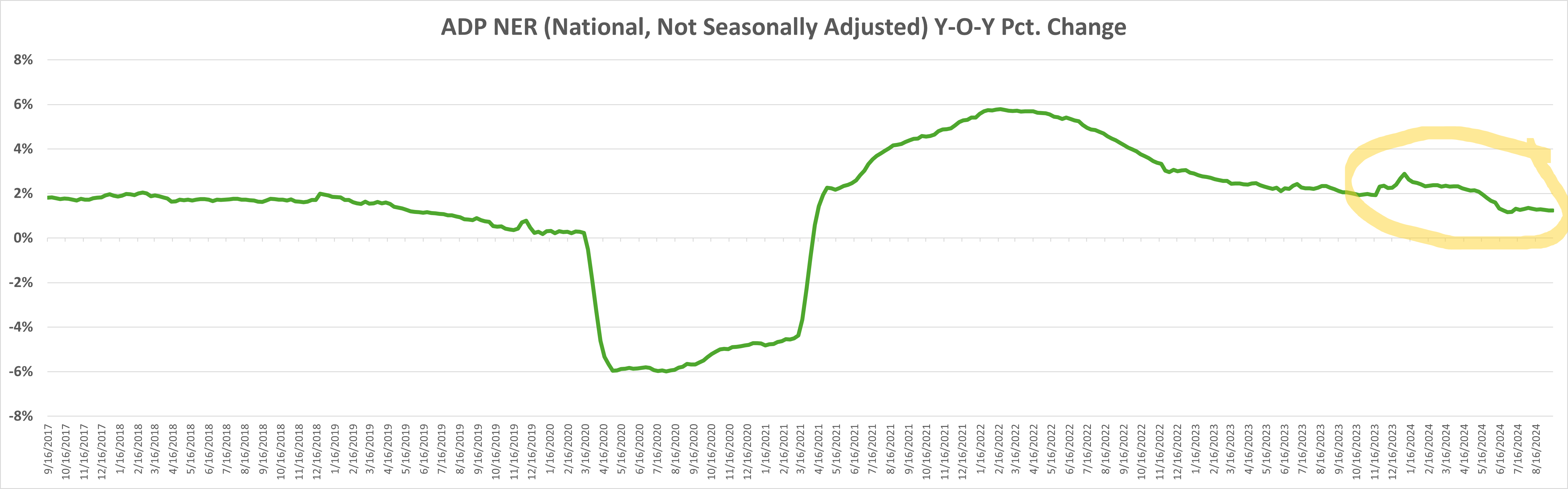
Our chart below plots the year-over-year percentage change in national employment (not adjusted for seasonality), as measured by ADP on a weekly basis.
The below chart directionally aligns with what I have observed as it relates to national employment in reviewing earnings calls, reviewing RIF reports, bankruptcy filings and the like over the past few years.
The below chart especially appears correct in relation to the past year (the yellow circle), over which time most employers that I am aware of are holding FTEs flat or are cutting FTEs.
ADPs seasonally adjusted employment figures (not shown here), paint a picture of a robust U.S. economy with an employment chart that is up and to the right. That is simply not reality in my view. Our chart better represents actual private sector employment.
TEK2day Premium subscribers may access the Excel file including our charts below the paywall.